On-the-Fly Custom Area Metrics: Bringing the Power of Polygons to Business Users
Summary
We have introduced a powerful new feature into Honeycomb Maps that lets users filter data based on custom polygons from their data warehouse. This filtering and aggregation happens on-the-fly, without requiring additional queries to the data warehouse. By reducing the friction and cost of working with custom areas, we enable our customers to extract better insights from their location data.
Here are some questions that this new feature can help answer:
- How profitable was this neighborhood last week?
- How many e-bike parking violations occured in this city district yesterday?
- How many parcels will be delivered by this driver tomorrow?
Areas Are Key for Location-Based Businesses
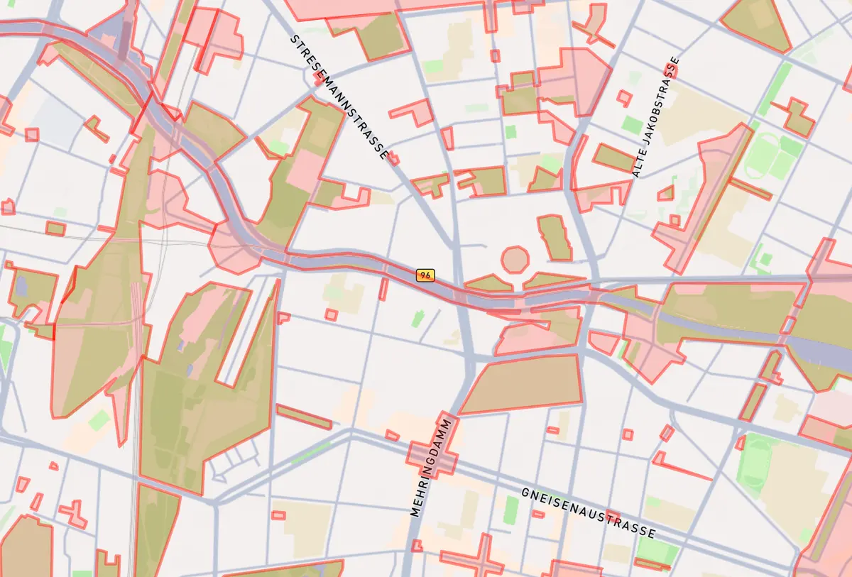
A map of areas in Berlin where shared scooters and e-bikes are not allowed to park
We work with logistics and mobility companies every day, and for many of our customers, areas are a core part of their business operations. For example, delivery companies create custom areas and assign them to drivers, making all packages in those areas the responsibility of specific drivers. Similarly, food delivery businesses define custom delivery areas for restaurants.
While many legacy companies still use administrative boundaries like counties or postal codes, we see a trend towards more purpose-built custom areas.
One of our early feature requests was to simply display custom polygons within Honeycomb. This was very well-received by our customers as it gave them visibility into their business areas, which previously existed only as rows in spreadsheets that had to be copy/pasted into mapping tools to visualize.
Going Beyond Static Data Layers
However, our forward-thinking customers wanted to go further. For them, seeing the polygons was helpful, but they wanted to filter and aggregate other datasets based on their polygons in real-time, just like they could filter dimensions of their data using drop-down filters in a traditional dashboard tool like PowerBI or Tableau.
For example, one customer wanted to analyze the performance and profitability of different neighborhood areas — identifying which ones cost the least to serve while generating high-value orders. While this data existed within the organization, it was siloed: order data was managed by one team and neighborhood area data by another.
Traditionally, this analysis would require finding a data scientist who knew how to use geospatial functions in their data warehouse to incorporate ST_Contains into a data pipeline for pre-aggregated metrics. But this approach has significant limitations:
- What if a point simultaneously sits in multiple areas?
- What if the business decides to change area boundaries over time?
- What if an analyst wants to tweak an area or combine two areas on the fly?
- What if a temporary area is create for an event, like a two-week festival?
What if filtering for an area was as simple as filtering on any other dimension?
Finding vehicles that are sitting within 3 different parking zones in Berlin. The names of the areas are selected from a drop-down list, and the filtering of the vehicle points is done in real-time for these areas. Data is not pre-joined or aggregated.
Based on our users' needs, we built an entirely new polygon filtering tool. This tool allows polygons to be selected from a data source and used to filter both map layers and components from any other data source.
Conceptual Basis: Data Modeling and the First Law of Geography
"Everything is related to everything else, but near things are more related than distant things." - Waldo Tobler
What began as a relatively simple feature request revealed something powerful about spatial data: different location datasets can be joined together simply because they both exist somewhere on the planet. This differs fundamentally from most other data types, where it's necessary to build a data model and define explicit keys that link data together.
Consider a pizza delivery app scenario: our platform might give us coordinates of users when they open the app (potential customers wanting pizza). We also know the areas where we've agreed to deliver (think of the delivery maps at traditional pizza places). These pieces of information can be related together despite coming from completely different sources. By connecting them, we can determine how many potential customers were interested in ordering, broken down by whether they fall within our current delivery areas.
Empowering Finance and Operations Teams to Explore Data Directly
The operation described above is a basic ST_Contains operation. Traditionally, you'd use a GIS tool like ArcGIS for ad-hoc queries or build it into a data pipeline with spatial SQL for automation.
However, GIS analysts aren't typically the ones setting business strategy and coordinating operations. Instead, it's operations teams in local markets who need to answer these questions. These operations managers want to explore the data, calculating different metrics and adjusting areas to develop insights and optimize the business.
This highlights a core theme tied to Honeycomb Maps' mission: spatial analysis has not been accessible to operations teams. Current tools are unwieldy, slow, and difficult to use. They're built for specialists with GIS training, not for those with general strategy and problem-solving backgrounds.
Identifying eligible distribution sites in Minneapolis for a new energy drink, using Honeycomb's custom polygon filter functionality. Metrics are calculated in real-time as the user edits the drawn area, allowing for interative data exploration.
Our new polygon features let users easily filter and aggregate data based on areas from another dataset, as simply as using a drop-down filter. We accomplish this by handling the spatial operations on the client side. This means that statistics for areas don't need to be pre-calculated within a data warehouse — users can select the areas they want to analyze, and data is aggregated into metrics in real-time. In addition to selecting polygons from a data warehouse, users also have the option of drawing a custom polygon or loading a GeoJSON file.
This approach solves several key challenges:
- It handles points that may fall into multiple areas
- It accommodates areas that change over time
- Polygon filters can be combined with other filters for powerful cross-filtering
- Since fresh data is pulled when the map loads, it's always up-to-date
Taking Analysis Further with Enriched Data Downloads
Many analysts use Honeycomb to explore spatial business data and then download raw data for specific areas of interest to analyze deeper with Excel pivot tables, Python, or to import into other business applications.
Honeycomb automatically enriches downloaded data with the polygons that the data is within. This makes it simple to incorporate polygons into pivot tables and other types of detailed analysis.
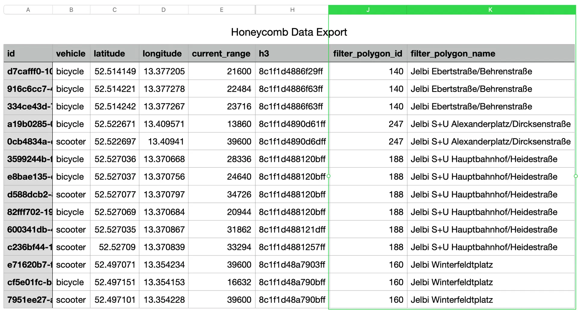
With our new on-the-fly polygon features, we now support enriching downloaded data with the area that points sit within. For example, a business with customer address data and a separate dataset of sales territories can download their customer list with the name and ID of the sales territory each customer sits inside automatically included. This column is then perfect to use as the basis for a pivot table, connecting spatial data directly to your traditional analytics workflow.
By bringing spatial analysis capabilities into familiar business tools, we're helping operations and finance teams make better location-based decisions without requiring specialized GIS expertise.
If you are working with custom areas in your business and want to start using them in your map dashboards, get in touch to schedule a demo.